Tuesday, 14 December 2010

Editing Blog

During the creation of our pop video we had to think ultimately about how the video would sell if it were to enter the marketplace.

During the editing of our pop video we used several editing programmes, which help us make the transitions more smooth and effective. The first we used to carry out basic editing cuts was Final Cut Pro which used the Final Cut Server programme as part of it’s package. This is a programme, which we use to put our shots together into the final cut. Once we had loaded our footage up into Final Cut Server we then opened it up in Final Cut Server and separated the shots into individual shots and labelling them, such as “CU guitar solo”. This helped us to see very clearly what shots we had and how they could fit into the slot we had. The second programme we used was Adobe AfterEffects. This is a programme in which we can edit colours, add backgrounds on top of greenscreens and create special edit transitions between shots. The third and final programme we used was Colors; this is a programme, which enables us to manipulate colours in order to keep continuity consistent and flowing. We used this a lot during the editing process, as some of the black of the backgrounds we shot didn’t quite match the black backgrounds in the shot so look clunky and you can see the shot changing.

When filming our pop video we had to think about continuity or discontinuity editing and the look we wanted to create. In our video we wanted to add some form of discontinuity editing. To do this we had some shots when the camera is tracking of the same band member going round and round in the same shot. We hoped this would discombobulate the viewer to add effect. Adding some element of discontinuity grabs the audience and demands their attention far more than a video with no continuity errors would.
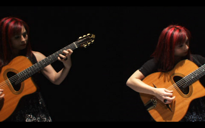
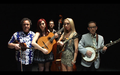
When creating our pop video we needed to think in a lot of detail what message we were trying to portray. We had to try and portray 2 messages through the video. The first was the message of the song, for our video the message of the song was naughtiness and playfulness. It was also about how a promiscuous girl should not be caged in but free to do what she wants. The second message we had to portray was the message of the brand. For The Toy Hearts we were trying to sell them as a package, their brand image would be a bluegrass style band with a modern style make up with the two front girls Sophia and Hannah. We wanted to try and make the band appeal to a younger audience. This is because at the moment there are no other acts like The Toy Hearts in the charts, they are a bluegrass style genre but we felt they could really appeal to a younger audience. We tried to break them into a younger audience by creating a very simple but effective video, which featured very basic shots and no special effects. It is not a tricked up video but an essentially simple video which featured just an alternative idea. We feel this reflects their music in a way, it is very simple just very well crafted and uses a very alternative idea to create something which is a vital accompaniment to the pop video.
To help the shoot day run smoothly we were required to create a call sheet for the day, this requires a huge amount of information such as the storyboard. This depicts each shot we hoped to shoot in the order we planned to as well. It also shows the length of each shot, the lyrics in the shot and the action in the shot. This is a document designed to make the shoot day much more relaxed, as we know exactly what we will shoot when. However, given that our storyboard was for the wrong location it meant it was very difficult to follow in some areas. We tried to follow as much of the storyboard as possible but this was difficult when we didn’t have the same location we storyboarded for. What we did was film the whole song orbiting in a wide shot so we got a whole run of it which we could drop shots into to break it up. We ran through the whole song varying the shot size from wide to extreme close up on hand movements and vocals being sung, this meant we had shots of everything in each different shot meaning we had several back ups and shots of every action in every size. We also did varying shots of each individual band member doing their solo or singing along to the song, this again provided us with more back ups. We also gradually added pieces of our 4 sets to the background in some of the shots, such as a jukebox, a bar or extras drinking. Adding various objects helped to break up the monotony that could occur if the background was completely black the whole way round.

When we edited the video we were using Final Cut Pro. From previous experience editing my AS production of an opening sequence to a thriller I found the best way to edit is to lay down one shot on the timeline, for example a wide shot. Then I found it much easier to slot shots in breaking up the long shot than constructing the video from scratch building up shots and seeing if they worked. This is the same formula we followed for editing our pop video and we found it worked quite well, however we did have issues when it came to seeing which shots worked together against the long shot on the bottom of the timeline.

When we came up with our rough cut, we were required to show one of our media studies teachers so he could give us some advice on what would make it better and make it flow smoother or reinforce the message we were trying to portray. We did this as we knew he had an expert view on what the video would look like as a whole media product. After his advice on what would make the video look better we went away and edited it further to make it into an overall better product.

When constructing our pop video we needed to think about Keith Negus’s 11 conventions of a pop promo video. We wanted to follow some of these conventions to ensure the audience wasn’t too unsettled. However, we also wanted to subvert some of these conventions to ensure our pop video was memorable to the audience and made them question or think about what was happening in the video. There were many conventions that we followed. These were:
• The explicit and unashamed promotion of the artist’s “image” as a specific product with a brand identity, ready for mass consumption.
• The featuring of the artist.
• Repetition of reoccurring thematic elements and generically specific iconography.
• A possible performance element.
• The flexibility to disregard realism.
• A carefully constructed mise en scene appropriate to the content and tone of the track.
• High impact instantly.

We also had to subvert some of these to keep the video interesting and attention grabbing. The ones we subverted were:
• A possible narrative structure
We didn’t want to create a narrative, as we believed that the audience’s attention should be focused on the performance, as they are an organic band. We also wanted to promote them, as a band so felt focusing on the performance would establish them as a real band with real musical talent.

• Use of special effects
We decided not to use any special effects, as we didn’t want to turn The Toy Hearts into a different type of band from where their roots actually are. We felt they were a natural band, and their image wouldn’t fit with special effects, CGI or any sort of animation.

• Shots cut tightly to the beat of the track
As we didn’t really have varying shots we couldn’t really cut the shots to the beat of the track. This is due to the orbiting of the camera. However, wherever possible we did try to cut the shots together in order to add effect.

Wherever possible we tried to pay attention to the composition rules and how our pop video fitted with them. Due to our non-static camera position it was very hard to abide with these rules at times. One rule that we did subvert was the left to right rule, our camera spun from right to left. This meant our members of the band entered the frame on the “bad” side of the screen. We did this for dramatic effect to try and exaggerate their edgy-ness and their disobedience. This fights the rule of thirds when the band would usually enter the frame from the left. Another composition rule we obeyed was the colours rule. We had to think very in depth about what kind of mood each colour shown in the frame would create. The first colour we had to think about was the background; this would be a very key colour as it is what the audience would see most of. For the background we chose black as it created a sense of mysteriousness, evil and fear of the unknown. We also had to think about the colours that each of the band members were wearing. For the girls we wanted them in a lot of red so Sophia with her red hair looked really vibrant against the black background. We also had to think about Hannah who wore a black and white dress with bright red lipstick. We had to think about what colours would stand out and represent them as “Femme Fatales” and as wild and free. We also had to think about the other band members who were all male, we chose blue as this is seen as a calming colour which made them seem like a good influence against the girls. The contrast between blue and red is also very great, this means they will look really good together on screen.

Monday, 29 November 2010

Account of Shoot Day

There is an extreme amount of planning and preparation that goes into a shoot day. This is because of many reasons such as the expense of keeping a film crew on location with all the equipment required to shoot a pop video. This is why we created our call sheet, to let everyone in the cast and crew know what will be happening throughout the day. However, there were some instances where we had to make elements of it up on the spot because of how late we decided the treatment for our pop video.

We shot our pop video on the new Sony NX5 HD video camera. This meant the media recorded would be to quite a high quality and it would be on card format making it quicker and easier to transfer to the computer for editing. This camera is very easy to use and we just used the internal microphone as we were not recording sound so felt no need to attach an auxiliary microphone on a boom pole.

When organising what would happen when throughout the day we paid close attention to the shooting script to try and get as many similar shots done as possible, this would also help to eliminate continuity errors. Continuity errors could occur if we decided the make up should be changed or if any of the band decided to change their hairstyles.

In the shooting of our video we had to think in detail about the lighting and how we would need to light the band in order to create some shadow but not too much otherwise their features would blacked out. We also did not want any of the lights we used to be shown in the video and as the camera would be orbiting we had to use lighting from above. This worked very well as it created a seamless lighting environment and we did not have any camera stands or leads in the frame. The lights we used were spotlights above each member of the band. These we mini-blonde lights and brought out just enough detail and created enough shadow the make it look effective but not enough to black out any features of the band members faces. This meant we did not use any 400W Redheads or 2000W Blondes.

During filming we all tried to vary our roles quite a lot so we all felt as though we were integral to the crew, because we have a group of 4 we did often have times when we had too many crew to do the jobs. There were 3 main jobs, which were essential to the filming, as well as one other that was less important. The main 3 were cameraman, director and playback. The fourth job, which we created, was looking after the band and ensuring they had all the necessary props and costumes. This also meant getting them drinks whenever necessary and taking them to lunch. Another job that we created was photographer; this is because for the digipak we would need several images and felt this would be a very good opportunity to capture these as it would be difficult to photograph The Toy Hearts again given that they live in Birmingham. Due to the nature of our set, often only 2 people would be able to be inside the set at any one time.

We had 4 main sets in our pop video. We wanted to use as many different sets as possible to supply some variation as a full length pop video of the same set could become slightly tiresome unless some really special camera work supplements it. We had already decided our 3 sets, however at the end of the day we then added one more set to our line up. This is because we felt that another element could add another dimension to the video and widen our target audience. The first set we used was a plain black curtain; there were many reasons for this very plan approach. The first and most predominant reason was that we were going to do close ups against this background and wanted the audience to focus as much as possible on the performance. We thought a plain background would ensure the audience would not be distracted. The second background was just a jukebox and 3 or 4 bar stools. This was to add some sort of narrative element to the video as it showed the type of environment they might perform in. The second set we used was a bar environment with 2 bar tenders and drinks being served, this helped to add a contrast between the very plain black curtain and the more busy bar. The fourth and final set was a “gig” layout. We put the band up on a raised platform and set up some cinema seats in front of the platform. We chose this on the day to try and widen the target audience as the band may now appeal to a younger generation.

We encountered many problems throughout the planning and making of our pop video. They started very early on when we first decided to use The Toy Hearts as they were initially very unresponsive and were very slow in email correspondences. We found out after we had discussed commitment issues that this was because they were touring in USA at the time and were struggling to find Internet access in remote locations. This made us very weary early on as we were unsure of their reliability and did not want to do planning for the video if we could not use the real band. This is because we wanted to create an original video using some form of alternative music and wanted to use an organically created band as we felt they would look more natural on screen. We also decided we wanted to use The Toy Hearts because they moved away from the typical “indie” music that is expected from people from our age group and wanted to break convention and make something which looked and felt more professional to the untrained eye.

The second problem we encountered was the possible treatment for the video. We were all very lost as to what treatment to give the video, as we knew we wanted to use the real band but couldn’t think of an appropriate treatment that was realistic and accessible. As a group we had lots of ideas, however not many of them were very safe or reasonable. We knew we wanted to create a very simple video which moved away from special effects, CGI and green screens, we also knew 3 sets we wanted to use but we didn’t know how we wanted to shoot it. However, we did come up with an idea but not until 3 days before shooting. This meant the storyboard we had created didn’t apply and a lot of the work on the day was improvisational, this did provide us with a lot of flexibility, which was nice. But it did also mean the shoot day was very stressful as we had to make a lot of it up on the spot.

The third problem we faced was a possible location for the video. Initially we had planned to shoot in a big country house near Winchester. However, that fell through due to wildlife living there and us not being allowed to disturb them. This posed us with a big problem as we only found out we couldn’t use the location a week before our shoot and we would now have to completely re think a location. After looking on the Internet and getting lots of prices for location we eventually just chose to shoot in our school’s TV studio. We decided this would be an appropriate location providing it was decorated accordingly. So we had a meeting with the set designer and came up with some appropriate sets that we could shoot in. Thus we chose our 3 sets as our group thought they appropriately fitted the band’s image and the type of environment we believed would represent them in a positively.

The fourth and final problem we encountered was the storyboarding aspect of the planning. We did not have a solid, concrete idea until very late on the in the planning process so we did not know what to storyboard for. This meant we had to storyboard for the treatment we had at the time and if it changed we would just have to improvise when it came to the shoot day. I did like this freedom to improvise on the shoot day as it provided us with some leniency and flexibility to do what we wanted. However, it would’ve been nice to know exactly what we were going to do, as it would mean we could’ve planned the shoot day better.

The one shot that I really feel worked well was the “gig” set. I feel it looked really effective. We constructed the set and then went on with our orbiting camera technique, the camera tracked into the set of the raised platform and the 8 cinema seats. I felt this seemed very interesting as the camera tracked into the scene, thus creating a point of view as if the audience is only fleetingly looking into the scene.

I feel the shoot day all in all went very well. There were some very unexpected events and some, which we had planned and accounted for. I feel we got on really well with the band and they were very willing to take instruction, they also looked really good behind the camera. They also made a real effort to look good for the video and they brought their own make-up artist, which made our jobs easier as we could concentrate solely on the shooting of the video. The band also did a gig in the dining room towards the end of the day to try and sell some of their albums and raise awareness of the band and it’s image, this went down really well and they sold several albums. This may also help the views for our video as more people within the school will know what type of music they play and what great musicians they are. I think the shot day went very well considering the late change of treatment. However, it may have been nice to know exactly what we were doing from an earlier stage so we could’ve planned better for the day. That way we may have not over ran on the day and would’ve finished within the allotted time. If it were up to me I also would’ve filmed our video earlier on so we had a longer amount of time to edit it, as it is fairly post production intensive.

Wednesday, 3 November 2010

Call Sheet

A call sheet is a fundamental document issued to every member of cast and crew on a shoot. This document contains a huge amount of information about the shoot day. It includes the following:


  • PRODUCTION TEAM INFORMATION- This includes the mobile telephone numbers of each of the members of the group, this is in case they disappear during any time of the shoot day when they are need them. It also includes their full names and any other information about them that may be necessary for the shoot day.
  • CAST LIST- This contains all information about each member of the cast. Such as their full name and mobile numbers in case they dissapear on the day of shooting.
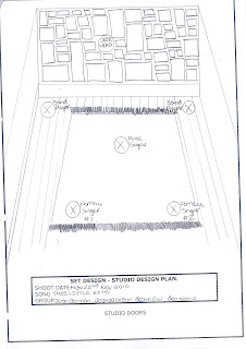
  • STUDIO SET PLAN- This is a simple photocopy of the set design plan as well as the brief that we showed to Dan. Aswell as any ammendments we may have made under Dan's instruction. In the industry this would be very precise and feature measurements of each of the materials used and dimensions of furniture or any decorations that would have been used. It will also include the lcoation on the set of each of the band members.
  • LIGHTING PLAN- This is also a photocopy of the studio design plan along with the brief about the specifics aswell such as any special things we would need such as dry ice machines. In our video we are also using gel's for the redheads so the brief will also have information about the gel's we are using and the number of gel that we need and in what order so if we need to get them again to do any follow-up shots we can easily.
  • PROPS AND WARDROBE- This is a very key area within the call sheet. It contains all the information about any props and wardrobe featured at any point during the video. It will explain each item of costuming in high detail aswell as who will be wearing it and where it is on loan from, whether it be the actor or the crew. It also features this information about each prop.
  • SCHEDULE- This is a detailed guide by timings of what will be happening when during the shoot day, it will allocate time for travelling, interior shots, exterior shots, lunch and clearing up. This will mean that every member of the cast and crew know what is happening when, it will also alert the crew if they are running behind schedule. Running late could cause potentially huge problems on the shoot day, for example, if we are doing exterior shots then we may want it light (naturally) so won't be able to shoot after 5:00pm.
  • STORYBOARD- This will include every page of the storyboard.
  • WORDS OF SONG (LYRICS)- This will include every single said word in the song. It may also be highlighted for the cast to make it easier for them to see at a glance. This is so that they can have the lyrics on the day and the cast will know where in the song they are at.
  • SHOOTING ORDER- A shooting order features 2 main things. It features a diagram of each of the camera locations that are used throughout the video. The second article included is the number of shots each camera position is used for. This is to reduce the camera movement and hopefully eliminate continuity errors occurring. This would be written like so: CAMERA PO.1: 1,7,9,15,17

Sunday, 31 October 2010

Set Build and Lighting Design

A set design and lighting plan is a very necessary part of a pop video for obvious reasons. Khuleshov states that 70% of meaning is in the visual, only 30% is portrayed through sound. The set and lighting creates the whole meaning of a video, it gives the first hint as to what the band is trying to portray and what the style of music is. However, it can subvert stereotypes of what the audience is expecting. For our new band trying to break into the music world we will need to pay a huge amount of attention to our set build and lighting design as it will be the first thing the audience see of our band. It will also be the audiences first impression of our band and first impressions count hugely in the music industry, especially when it is a new band that will be trying to achieve a larger share of the market they operate in.

Once we had drawn up the set and lighting design plans we had to present them to our technician (Dan) so he could get a feel as to what we are trying to portray. We also played him our song he could understand the stance we were trying and the genre of music which we were operating. We spoke as a group on how we wanted the set to be built and the kind of lighting we wanted, E.G. low key, high key.
When we showed Dan our set design plan we talked through each option, he had a catalogue of studio design options. We chose out each piece of design that we would want in the studio to make it look authentic. He then told us that a couple of months each year he worked at an opera house which was attached to a very grand but dilapidated house. This is exactly the type of location we were trying to create in the studio. The house is called The Grange and is located just outside Winchester, although this will be quite a long way to get or band and all their instruments we are prepared to make the journey in order to get a really authentic looking location. However, we are unable to visit the location before to work out very detailed lighting plans and storyboards. Although, another member of the group and I are visiting the location as part of the crew on another pop video shoot so we will try and look at what we think we can do in the space. We will think about specific areas in which we think will look effective to shoot in, as well as location of lights and possible gels we want on our lighting.
When we showed him our lighting plan he agreed that the lighting should be fairly low key to reflect the mood in the song. We also suggested the possible use of some gels on the lighting to create a sort of "yellowy" tint to the image. He did say this could be done in AfterEffects however, we did not want this tint to go over the whole image, just the people in the image. We decided that the way to get this yellow tint would be to mix several filters in order to get a feeling of depth as well.


This is an example of the colour tint we would like on our image.


Friday, 22 October 2010

Problems We Encountered

Inevitably, a film crew will always encounter several issues when planning any media product. These can have devastating effects for a film crew on a music video, especially if they have the whole crew when each day of shooting costs around £1 million. This means each day of the shoot must be planned with military precision.

We are no exception to this rule, we have needed to plan our shoot day (22nd November) in a lot of detail. However, we have encountered several issues. These are listed below:


  • A possible treatment for the video

  • Band responsiveness to correspondence

  • The location for the video

  • Storyboarding for the video

The first issue, the treatment for the video is a very big issue. Initially we were very stuck as to how to treat the video, what we should do with it and how many aspects it should contain. After much deliberation we decided we should have a very strong performance element due to the nature of the song. After deciding this we contacted the band and asked for any input they may have on a treatment for our video. We also asked them if they had any input on the location of the video, they sent us several images and gave us some clues as to what they would like (black and white with a red aspect) and what they wouldn't like (a pub based video). They also sent us several images which inspired them and which they liked the look of for their digipak cover. This helped us massively as we now had more of a guide as to what they wanted in the video and what they felt the video represented. After getting some feedback from the band we finally agreed that the video suited a strong performance element in the video and maybe a small narrative element which they suggested could be drinking or doing something mischievous to go with the lyrics in the song.


The other issue we found was the location. We had tried several locations and they all had restricting factors which meant we could not use them. Such as, other events taking place on our shooting date, meaning they were unavailable. Another issue we found was the large sum some locations were asking for in order to use their locations just for several hours, these sums went up to £2000 for 5 hours. This was simply not feasible as we could not get this amount of money together in such a short space of time. We also found that some of the locations were not willing to allow us to use their location due to our ages and the product we were producing, this was mostly big locations which worked primarily with film not pop videos.
Kings Theatre, Portsmouth


Barn Theatre, Oxted


Wilton's Music Hall, London

Due to our late decision of locations and treatment this meant we had issues in the storyboarding process as we did not know what to draw for the illustration of the storyboard. In such a lengthy process we didn't want to storyboard the wrong thing and have to re-do it all including new illustrations. However, to meet deadlines we did storyboard for the first location. This was necessary to get other stages of pre-production prepared for the shoot day which was quickly approaching.

Our final issue was in the early stage of pre-production whilst we were trying to determine for definite what treatment we wanted to do. We were very keen to use a real band in order to create some sense of realism in the video, so when the opportunity to use "The Toy Hearts" came around we grabbed it with both hands. However the band initially were quite slow and unresponsive when it came to us e-mailing them, this confused us greatly as we needed a band that would be very responsive and quick when it came to decisions and correspondences. We later learnt that the reason for this was they were abroad in America touring, we related our concerns to them and they assured us that they were fully involved in the making of the video and they apologised for their initial lack of urgency in replying to e-mails.

New Location

Locations are an essential part of any music video. They can hugely effect how the audience perceives a new music act. Especially if it is a new band trying to break into the music world.

We contacted many locations to ask if we were able to use them however, during this process we encountered many problems. One of the main problems we had was the date of our shoot, a lot of the locations that we contacted had events on the date we were filming. Another issue we encountered was the cost which they would need in order for us to secure the location, some of them asked for huge amounts of money in which we just couldn't afford. We also found that some locations were not willing to let us use the location due to our status as students rather than big production companies in which could promote them as a business.

Below is a list of locations we contacted, all of which turned our request down:


  • Wilton's Music Hall, London


  • The Barn Theatre, Oxted


  • The King's Theatre, Southsea


  • New Theatre Royal, Portsmouth


  • Cranleigh Arts Centre, Cranleigh


Here is a copy of an email in which we wrote to The Barn Theatre, Oxted:


To Whom It May Concern,

I am a student from a sixth form college in Surrey and am studying Media A2 level. For our coursework in the A2 year we are required to shoot a pop video, for our video we are shooting a band called They Toy Hearts who are an up and coming band who have just got home from touring in America. I am working in a production team of four people in total. I have visited the Barn Theatre recently to watch The Happiest Days Of Your Life and really liked the look of the theatre and think it would look really good in our video. We would like to shoot the video on the 22nd November for a whole day. I would just like to know how much it would cost and what conditions you have. A quick response would be greatly appreciated so we can make alternative arrangements if necessary.

Thanks
Josh Gorman


Eventually, however we did gain access to a good location named Grange Park. We got access to this through our Lighting Director, he works for them several months of the year int he opera house section of the mansion. Grange Park is located just outside of Winchester in a rural area. It is a very old grand house with a very dilapidated interior, this is exactly the style of location we were looking for. The interior of the house is very dilapidated and contains many rooms all in different stages of restoration. The exterior of the house is very grandiose and very imposing and looks very typically English, which is exactly what we are going for. Luckily we will be able to visit the location on the 5th November as a crew on another music video. This will give us a chance to scope out exactly where we want to shoot and possible shots we can use. Unfortunately as we have only just decided the location we haven't had a chance to storyboard for it, however we will try and do this once we have visited the location on the 5th November.


Below are some pictures of the location, some of the exterior and some of the interior as well.


Here are some shots of the exterior of the house.


Thursday, 21 October 2010

Set Design Plan

Set designs are essential for the set design director. This shows them what will be featured in the set, if the set is being built from scratch. It also shows what a location will have in it such as pictures and sofas. It sets out where the members of the band will be placed as well.

We drew the plan on a set design sheet, which featured the name of our group and the title of our song and the day of our shoot. When we drew the final set design we had to go into a huge amount of detail about the location of each item that would be on the set. We also had to be very precise about where band members would be placed and think about whether they would all be seen in a long shot in their positions. We also had to create a brief about what else may be included in the set and possible props we may need to supply which wouldn’t already be in the set. We also needed to state what kind of mood we wanted to create and what kind of feeling we wanted to be portrayed.

Unfortunately, because our locations kept changing due to accessibility and other external factors we did several set design plans. Each included a brief about the location characteristics and what mood we wanted to create. As well as a map of where each band member would be located in relation to the set. Here is an image of a real set design from a media product.

When we designed the studio set we had to think about camera angles as well to ensure we would have in frame what we wanted.Attatched is the set design for the studio aspect of our performance video.

Wednesday, 20 October 2010

Lighting Plan

A lighting plan is an essential document to the set design team. It shows the set designer what style of lighting the director or cinematographer is going for. It also shows the location of the lights on the set of the shoot, as well as the different types of lights such as Strobe or Redhead. A lighting design is essential for each location that the product will be shot on, for example for our shoot this could be the studio, and an external location such as a field.

Due to our location being changed so often this presented us with an issue as we didn't know whether to create a plan for each location we were thinking of or just do one once we had our final location.

The lighting will be either low key or high key. It may also have lots of different effect such as a red tint or silhouetted. In our video we wanted a low key lighting style, we also wanted a red tint to it. This means we will need tints on the redheads we use. For our video in the studio part of the video we are planning to use 3 redheads in the form of a flood, spot and fill. We also plan to silhouette the other 2 members of the band. We also placed spotlights on the female members of the band to illuminate their faces as they are more aesthetically pleasing and look attractive on screen. However, we are also placing a flood on the male member of the group as he has a very interesting face which would look very good on screen.

Attached is the lighting plan for our studio element of our pop video.

Tuesday, 19 October 2010

Storyboarding

Storyboards are vital. In the storyboards we worked out the types of shots we were going to use, camera angles, the colours and shapes, the mise en scene, the camera movements, the framing and the way we would edit. So in the storyboard we work everything out, we plan, we test, in the real world the storyboard artist costs a lot less per day than the £1 million plus that the movie would cost.

A professional music video would consist of around 90 shots all detailing in very intimate detail what happens in each shot.

So with our storyboard we are trying to visualize, to work out what is on screen. If it works we will then shoot it and then we will edit it together just like putting a puzzle together.

Unfortunately our plan kept changing from our timeline to our storyboard. This meant our storyboard kept changing right up to the day of filming.

The Storyboard is an extension of the timeline, it builds on what the timeline establishes in the way of images and lyrics. The storyboard includes far more information than the timeline does, it includes:

  • A drawing of the image
  • The timing of the shot
  • The shot action
  • The sound in the shot (the song lyrics)
  • The style of lighting in the shot
  • The edit transition to the next shot
  • The shot number
  • The shot location

In the creation of the storyboard we had to think much more in detail about shot timings. The timeline allows us to see what works and does not, whereas the storyboard allows us to look a lot more in depth into the timings of each shot and the movement in each shot and how it will edit into the next shot, after we have completed all the storyboard we will need to film it on a camera and edit it so the storyboard follows the form that the pop video will take. We will cut it on Final Cut Pro, this will enable us to see how it will look as a total product.

Unfortunately, we do not have animated storyboarding software at our school. This shortens the storyboarding process dramatically. This enables the user to type in what they want the character to be doing, the character then animatically acts out what it is instructed to do.

During one of the guitar breaks in our song we decided that this instrumental should feature a close up on the hands strumming the guitar to the music. This is to exaggerate that the band play their own music, organically rather than synthetically. It also connects the music to the instrument that is being played, this is an example of Khuleshov's theory.

Another shot we have used with the music is the shot where the male member of the band's foot is tapping along with the beat of the song. We used this shot to build momentum in the build up to the song, it helps to gain tension and keeps the audience far more captivated than a shot of one of the band member's faces would. It also adds an element of mystery to the video which is very appropriate for the video given that it is about how people have 9 lives.

Most of out shots will be straight intercuts. This is done for many reasons, one of which is the constant changing of the shot meaning that any other transition would look too "choppy" and may lead the audience to feel unsettled. Another reason for this is that the straight cuts may help to play with the quick speed of the song, rather than slowing it down through fussy editing transitions.

Unfortunately, due to the constant change in location of our second performance/narrative element we have not storyboarded for this aspect. We are also unable to storyboard accurately for this part as we have not visited the location, therefore do not know exactly what it is like. We are however visiting the location on the 5th November, which is 17 days before our shoot. When we visit there we will try and look around to see any scope for some good shots, I will also take my camera to show the rest of the group. We should hopefully be able to storyboard between the two dates of visit.


Timelining

Timelining is the act of placing words and images with timings in the song however, this is only a first try attempt as the storyboard will go further into it. The crucial thing with the timeline is to test out whether it works with the song. This helps the production group to adapt the timings in the song to the images, it uses the lyrics in the song as well as riffs in the song to divide up the song. This enables the production group to see what works and what does not work with the song lyrics and timings.

In our song there are around 7 guitar riffs, this called us a problem for several reasons. We knew we couldn't have extreme close ups for every guitar riff as this would leave the audience expecting what is coming next. It might also bore the audience because they have seen the shot several times so may get restless. This would mean we would have to choose different shots for each riff or vary the shots in order to keep the audience interested and on edge with our video. Due to us not wanting to bore the audience we had to vary the shots we used so we had extreme close ups mixed with long shots.

Another example would be that our group has two females that sing and are young and attractive. The third member of the group is a 50 year old man. So in our timeline we could plan to be more centred around the young and attractive girls than the older, male instrumentalist. But the man has a very interesting face visually which would work on screen, so we may end up shooting lots of close ups of him. I attach copies of my timeline.

Friday, 8 October 2010

Screen Test


When establishing whether to use people in music videos or any widely distributed media product you must carry out a screen test to ensure they look good and "work" behind the camera. This may sound silly but what can happen a lot is an actor wont work behind the camera, causing a huge amount and anxiety to the casting director.
When carrying out a screen test the casting director must think about many things. One of these things is accessibility, this may not be so essential for a big media product but for us is a key thing to think about. We will also need to think about whether the band would work well in an image that we would publish in our Digipak. We would also have to think about their personality and their amenability to being directed and whether they are accommodating enough to take instructions given by the director.

As we are using a real band who are based in Birmingham we felt there was no need to ask them to travel down for a screen test. Instead we looked on their website at their pictures, and some of their videos on http://www.youtube.com/. Whilst looking at these videos we looked at the comments on them, almost every comment was positive and some people had said they had seen them live and they had great stage presence. This gave us a good indication of their cohesiveness on stage. We needed to do this as the mixture of people and age groups could create a strange combination. When we did the camera test we noticed that the two female members of the band looked better on screen as they are more aesthetically pleasing and attractive, whereas the older male member of the band was less attractive. However, he did have a face which worked well behind the camera.But they did work very well on stage and all looked brilliant behind the camera.