There are five stages to a production according to film theorist Richard Maltby. These are research and development, pre production, the shoot, editing and distribution. Exploring the conventions of a pop video we imitated in the main but subverted on occasion.
During the research and development stage we looked very extensively at other pop promo videos. We did this for many reasons, first to think about a potential treatment. Then, to see whether pop videos similar to ours subverted or imitated conventions of pop videos. The main ones we looked at were artists such as Mumford & Sons, Imelda May and Sarah McLaughlin. This was after the band had said that they favoured this style of pop video. We thought about whether they imitated or subverted conventions in terms of Keith Negus’s 11 conventions of pop videos, these are:· The explicit and unashamed promotion of the artist’s “image” as a specific product with a brand identity, ready for mass consumption· The featuring of the artist (almost without exception)· A wide and extensive use of shot types, camera angles and movement
· Repetition of reoccurring thematic elements and generically specific iconography (one key element often being dominant and providing skeletal structure for the promo)
· A possible narrative structure
· A possible performance element
· The flexibility to disregard realism
· Shots cut tightly to the beat of the track· Use of special effects (lighting, animation, CGI, in-camera effects)· A carefully constructed Mise-en-Scene appropriate to the content and tone of the track· High impact instantlyKhuleshov, the Russian film theorist, says that over 70% of the meaning and feeling of a media text comes through the visual. Even in a pop video where the song is being sold the visuals are crucial. So we had to think what out message about the song and band was to be and how we would put this over visually.
We also had to think how we were going to communicate genre through the visual not just the audio. We studied the theorist Roland Barthes, who believes that to realise genre audiences should have two main factors,
jouissance and
plaisir. He believes audiences require these two factors in order to realise the genre of a media product.
Plaisir is the pleasure through the expected and
jouissance is pleasure through the unexpected. We paid close attention to Barthes’s theory during the creation of our pop promo video. We imitated some conventions in order to fulfil the audience’s need for
plaisir, the joy through the unexpected. We also subverted the conventions in order to supply the audience with
jouissance, pleasure through the unexpected.
When constructing a pop promo video the director must think about the song and the video combined and how they will come across to the audience. Our song was trying to portray a very seductive message that a girl should be free, and should not try to be constrained or caged in. It is also trying to portray the story of a promiscuous girl who likes to lead men on. This fits the band’s image very well as the two main singers of the band are attractive females. The band’s image is a very simple one they are an eccentric, wacky British born and raised band. They are an organic band, meaning they are performing music of their own accord and are not being forced to by a record label. This adds to their band image as this makes them a more alternative band. 
This shot depicts the basic idea of our pop video, the orbiting of the
camerae. I
believe our whole video follows the
Negus rule "High impact instantly". This is because it is a very alternative
to any other
contemporary pop videos. The colours in the orbiting shots were all very carefully crafted to ensure the shots worked as a whole.
When I say the camera is orbiting I mean that it is doing a constant tracking movement through 360 degrees and then carrying on to do the same again and again. Tracking is a gentle movement in our pop video, taking the audience into the action and very close
up to the artists. The camera is circling which is a gentle movement which goes left to right with the viewers eye. The shapes in the
mise-en-scene are gentle shapes also, such as the double bass and violin and there were no threatening diagonal or sharp lines anywhere in the background. All of this works on film making conventions to say gentle and pleasant. We do cut to the beat in the main when the track does cut and follow
Negus in this. But we subvert
Negus in our sense of almost unreality for the group as portrayed through that orbiting camera.
This shot depicts the whole band in their entirety, as our pop video didn’t really have any specific storyline it is difficult to relate it to Keith Negus’s conventions. However, this does follow “The featuring of the artist, almost without exception” rule. It also follows the rule of thirds as the two attractive girls heads are in hot spots 1 and 2. The colours are also very relevant in this shot as the colours are bright and vibrant, exaggerating the band’s personality and the song we did, as it was a very upbeat and fun song. This shot is very similar to a shot shown in the Mumford & Sons video of “Little Lion Man”, this is a good thing as when we asked the band for inspiration they said they were very fond of this particular video. The
Mise en scene in this shot is very plain; this is because we wanted the audience to focus on the band rather than being distracted by busy backgrounds.
This shot depicts very clearly a member of the band playing their instruments. This follows the “Wide and extensive use of shot types, camera angles and movement”. This
shot also demonstrated the fact that the band is organic and play all their own music rather than singing over a
pre-recorded track or lip-
syncing.

This shot depicts the band on a stage singing whilst there is an audience, as well as lights. This shot follows
Negus’s rule of “Use of special effects (lighting, animation,
CGI, in-camera effects)”. The lights in the background followed this rule and ensured the scene was flooded with light. It also supplied the scene with some sense of special effects and creativity.
The
Digipak also has an instrumental role in the challenging and imitating conventions. The
 Digipak
 does imitate the
Negus convention “The featuring of the artist”, as it depicts the whole band on a stage. I feel the
Digipak reflects the band very well as it looks aged due to the worn background, however features bright colours which I feel makes the
Digipak feel more modern and will stand out on a shelf of CD’s. I also believe it promotes their brand image as it is quite retro and features some iconic elements such as the Coca Cola sticker.
This is the back cover of the album cover,
th
e background and corner design is very similar to the front cover and both the inlays. This creates a sense of synergy and also a sense of recognition throughout the whole brand and this background and corner image will also be on the advert poster. This also uses a mixture of dark and bright colours to exaggerate the heritage of the band, as well as also showing the retro feel with the corner images.
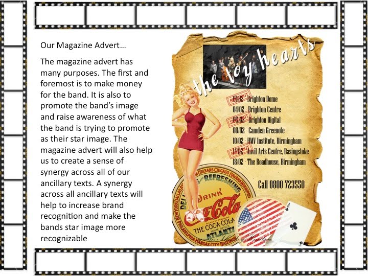
This is the magazine advert. It uses a lot of the same elements as the
Digipak such as the background and corner design. This creates a sense of synergy across the Toy
Hearts brand and their products. It also makes all of the elements instantly rec
 ognisable
 to their target audience. The use of the brown background suggests a Khaki theme, linking back to soldiers in the second world war. The image of the girl in the bathing suit is also from that time and I used
Bookman Old Style font which is one often used to convey the 1940's and 50's. This era is one that our band are fond of and play a lot of songs from, hence the very colours, images and shapes connote the nature of our bands music. The red, white and blue of course stresses the American links.


 The first inlay features the typical background and corner design. It also features each member of the band’s instruments close up. This was to help exaggerate the fact that the band’s music is organic and they play all of their own instruments, unlike many pop acts in the charts today. We wanted to keep this inlay fairly plain and simple because all of the other inlays are quite busy and have a lot going on in them.
 The second inlay features the same background and corner design. It also features the lyrics to the song we did the pop video to. We put these in to imitate other digipak covers that are on the market nowadays. This is also to help the audience feel as thought they have some interactivity with the digipak. This inlay also features two images of the band’s logo. The top logo I created by copying a Jack Daniels logo then getting rid of the logo and creating our own for the band. I did this because The Toy Hearts said to us that they liked this style. The logo below is The Toy Hearts real logo which we used. This is to promote the real band as this loo will be instantly recognisable to any fans.
 convention of other album covers. It was also to tell the audience what was on the album if they were considering buying it. There is also a large image of a double bass, I took this photograph and believe it looks quite good on the back as it is a nice photograph and showcases the band’s real essence. The back cover also features a barcode, a copyright logo and a record label. This is to imitate conventions of other digipak covers and also to make the digipak seem as realistic as possible.
 This shot depicts the band on a stage singing whilst there is an audience, as well as lights. This shot follows Negus’s rule of “Use of special effects (lighting, animation, CGI, in-camera effects)”. The lights in the background followed this rule and ensured the scene was flooded with light. It also supplied the scene with some sense of special effects and creativity.
 Digipak does imitate the Negus convention “The featuring of the artist”, as it depicts the whole band on a stage. I feel the Digipak reflects the band very well as it looks aged due to the worn background, however features bright colours which I feel makes the Digipak feel more modern and will stand out on a shelf of CD’s. I also believe it promotes their brand image as it is quite retro and features some iconic elements such as the Coca Cola sticker.