During the creation of our pop video we had to think ultimately about how the video would sell if it were to enter the marketplace.
During the editing of our pop video we used several editing programmes, which help us make the transitions more smooth and effective. The first we used to carry out basic editing cuts was Final Cut Pro which used the Final Cut Server programme as part of it’s package. This is a programme, which we use to put our shots together into the final cut. Once we had loaded our footage up into Final Cut Server we then opened it up in Final Cut Server and separated the shots into individual shots and labelling them, such as “CU guitar solo”. This helped us to see very clearly what shots we had and how they could fit into the slot we had. The second programme we used was Adobe AfterEffects. This is a programme in which we can edit colours, add backgrounds on top of greenscreens and create special edit transitions between shots. The third and final programme we used was Colors; this is a programme, which enables us to manipulate colours in order to keep continuity consistent and flowing. We used this a lot during the editing process, as some of the black of the backgrounds we shot didn’t quite match the black backgrounds in the shot so look clunky and you can see the shot changing.
When filming our pop video we had to think about continuity or discontinuity editing and the look we wanted to create. In our video we wanted to add some form of discontinuity editing. To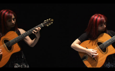 do this we had some shots when the camera is tracking of the same band member going round and round in the same shot. We hoped this would discombobulate the viewer to add effect. Adding some element of discontinuity grabs the audience and demands their attention far more than a video with no continuity errors would.
When creating our pop video we needed to think in a lot of detail what message we were trying to portray. We had to try and portray 2 messages through the video. The first was the message of the song, for our video the message of the song was naughtiness and playfulness. It was also about how a promiscuous girl should not be caged in but free to do what she wants. The second message we had to portray was the message of the brand. For The Toy Hearts we were trying to sell them as a package, their brand image would be a bluegrass style band with a modern style make up with the two front girls Sophia and Hannah. We wanted to try and make the band appeal to a younger audience. This is because at the moment there are no other acts like The Toy Hearts in the charts, they are a bluegrass style genre but we felt they could really appeal to a younger audience. We tried to break them into a younger audience by creating a very simple but effective video, which featured very basic shots and no special effects. It is not a tricked up video but an essentially simple video which featured just an alternative idea. We feel this reflects their music in a way, it is very simple just very well crafted and uses a very alternative idea to create something which is a vital accompaniment to the pop video.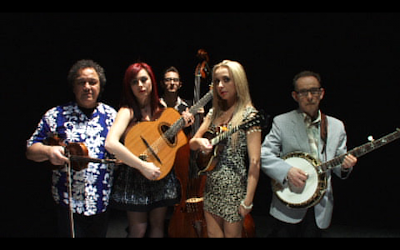
To help the shoot day run smoothly we were required to create a call sheet for the day, this requires a huge amount of information such as the storyboard. This depicts each shot we hoped to shoot in the order we planned to as well. It also shows the length of each shot, the lyrics in the shot and the action in the shot. This is a document designed to make the shoot day much more relaxed, as we know exactly what we will shoot when. However, given that our storyboard was for the wrong location it meant it was very difficult to follow in some areas. We tried to follow as much of the storyboard as possible but this was difficult when we didn’t have the same location we storyboarded for. What we did was film the whole song orbiting in a wide shot so we got a whole run of it which we could drop shots into to break it up. We ran through the whole song varying the shot size from wide to extreme close up on hand movements and vocals being sung, this meant we had shots of everything in each different shot meaning we had several back ups and shots of every action in every size. We also did varying shots of each individual band member doing their solo or singing along to the song, this again provided us with more back ups. We also gradually added pieces of our 4 sets to the background in some of the shots, such as a jukebox, a bar or extras drinking. Adding various objects helped to break up the monotony that could occur if the background was completely black the whole way round.
When we edited the video we were using Final Cut Pro. From previous experience editing my AS production of an opening sequence to a thriller I found the best way to edit is to lay down one shot on the timeline, for example a wide shot. Then I found it much easier to slot shots in breaking up the long shot than constructing the video from scratch building up shots and seeing if they worked. This is the same formula we followed for editing our pop video and we found it worked quite well, however we did have issues when it came to seeing which shots worked together against the long shot on the bottom of the timeline.
When we came up with our rough cut, we were required to show one of our media studies teachers so he could give us some advice on what would make it better and make it flow smoother or reinforce the message we were trying to portray. We did this as we knew he had an expert view on what the video would look like as a whole media product. After his advice on what would make the video look better we went away and edited it further to make it into an overall better product.
When constructing our pop video we needed to think about Keith Negus’s 11 conventions of a pop promo video. We wanted to follow some of these conventions to ensure the audience wasn’t too unsettled. However, we also wanted to subvert some of these conventions to ensure our pop video was memorable to the audience and made them question or think about what was happening in the video. There were many conventions that we followed. These were:
• The explicit and unashamed promotion of the artist’s “image” as a specific product with a brand identity, ready for mass consumption.
• The featuring of the artist.
• Repetition of reoccurring thematic elements and generically specific iconography.
• A possible performance element.
• The flexibility to disregard realism.
• A carefully constructed mise en scene appropriate to the content and tone of the track.
• High impact instantly.
We also had to subvert some of these to keep the video interesting and attention grabbing. The ones we subverted were:
• A possible narrative structure
We didn’t want to create a narrative, as we believed that the audience’s attention should be focused on the performance, as they are an organic band. We also wanted to promote them, as a band so felt focusing on the performance would establish them as a real band with real musical talent.
• Use of special effects
We decided not to use any special effects, as we didn’t want to turn The Toy Hearts into a different type of band from where their roots actually are. We felt they were a natural band, and their image wouldn’t fit with special effects, CGI or any sort of animation.
• Shots cut tightly to the beat of the track
As we didn’t really have varying shots we couldn’t really cut the shots to the beat of the track. This is due to the orbiting of the camera. However, wherever possible we did try to cut the shots together in order to add effect.
Wherever possible we tried to pay attention to the composition rules and how our pop video fitted with them. Due to our non-static camera position it was very hard to abide with these rules at times. One rule that we did subvert was the left to right rule, our camera spun from right to left. This meant our members of the band entered the frame on the “bad” side of the screen. We did this for dramatic effect to try and exaggerate their edgy-ness and their disobedience. This fights the rule of thirds when the band would usually enter the frame from the left. Another composition rule we obeyed was the colours rule. We had to think very in depth about what kind of mood each colour shown in the frame would create. The first colour we had to think about was the background; this would be a very key colour as it is what the audience would see most of. For the background we chose black as it created a sense of mysteriousness, evil and fear of the unknown. We also had to think about the colours that each of the band members were wearing. For the girls we wanted them in a lot of red so Sophia with her red hair looked really vibrant against the black background. We also had to think about Hannah who wore a black and white dress with bright red lipsti
 ck. We had to think about what colours would stand out and represent them as “Femme Fatales” and as wild and free. We also had to think about the other band members who were all male, we chose blue as this is seen as a calming colour which made them seem like a good influence against the girls. The contrast between blue and red is also very great, this means they will look really good together on screen.
During the editing of our pop video we used several editing programmes, which help us make the transitions more smooth and effective. The first we used to carry out basic editing cuts was Final Cut Pro which used the Final Cut Server programme as part of it’s package. This is a programme, which we use to put our shots together into the final cut. Once we had loaded our footage up into Final Cut Server we then opened it up in Final Cut Server and separated the shots into individual shots and labelling them, such as “CU guitar solo”. This helped us to see very clearly what shots we had and how they could fit into the slot we had. The second programme we used was Adobe AfterEffects. This is a programme in which we can edit colours, add backgrounds on top of greenscreens and create special edit transitions between shots. The third and final programme we used was Colors; this is a programme, which enables us to manipulate colours in order to keep continuity consistent and flowing. We used this a lot during the editing process, as some of the black of the backgrounds we shot didn’t quite match the black backgrounds in the shot so look clunky and you can see the shot changing.
When filming our pop video we had to think about continuity or discontinuity editing and the look we wanted to create. In our video we wanted to add some form of discontinuity editing. To
 do this we had some shots when the camera is tracking of the same band member going round and round in the same shot. We hoped this would discombobulate the viewer to add effect. Adding some element of discontinuity grabs the audience and demands their attention far more than a video with no continuity errors would.
When creating our pop video we needed to think in a lot of detail what message we were trying to portray. We had to try and portray 2 messages through the video. The first was the message of the song, for our video the message of the song was naughtiness and playfulness. It was also about how a promiscuous girl should not be caged in but free to do what she wants. The second message we had to portray was the message of the brand. For The Toy Hearts we were trying to sell them as a package, their brand image would be a bluegrass style band with a modern style make up with the two front girls Sophia and Hannah. We wanted to try and make the band appeal to a younger audience. This is because at the moment there are no other acts like The Toy Hearts in the charts, they are a bluegrass style genre but we felt they could really appeal to a younger audience. We tried to break them into a younger audience by creating a very simple but effective video, which featured very basic shots and no special effects. It is not a tricked up video but an essentially simple video which featured just an alternative idea. We feel this reflects their music in a way, it is very simple just very well crafted and uses a very alternative idea to create something which is a vital accompaniment to the pop video.

To help the shoot day run smoothly we were required to create a call sheet for the day, this requires a huge amount of information such as the storyboard. This depicts each shot we hoped to shoot in the order we planned to as well. It also shows the length of each shot, the lyrics in the shot and the action in the shot. This is a document designed to make the shoot day much more relaxed, as we know exactly what we will shoot when. However, given that our storyboard was for the wrong location it meant it was very difficult to follow in some areas. We tried to follow as much of the storyboard as possible but this was difficult when we didn’t have the same location we storyboarded for. What we did was film the whole song orbiting in a wide shot so we got a whole run of it which we could drop shots into to break it up. We ran through the whole song varying the shot size from wide to extreme close up on hand movements and vocals being sung, this meant we had shots of everything in each different shot meaning we had several back ups and shots of every action in every size. We also did varying shots of each individual band member doing their solo or singing along to the song, this again provided us with more back ups. We also gradually added pieces of our 4 sets to the background in some of the shots, such as a jukebox, a bar or extras drinking. Adding various objects helped to break up the monotony that could occur if the background was completely black the whole way round.
When we edited the video we were using Final Cut Pro. From previous experience editing my AS production of an opening sequence to a thriller I found the best way to edit is to lay down one shot on the timeline, for example a wide shot. Then I found it much easier to slot shots in breaking up the long shot than constructing the video from scratch building up shots and seeing if they worked. This is the same formula we followed for editing our pop video and we found it worked quite well, however we did have issues when it came to seeing which shots worked together against the long shot on the bottom of the timeline.
When we came up with our rough cut, we were required to show one of our media studies teachers so he could give us some advice on what would make it better and make it flow smoother or reinforce the message we were trying to portray. We did this as we knew he had an expert view on what the video would look like as a whole media product. After his advice on what would make the video look better we went away and edited it further to make it into an overall better product.
When constructing our pop video we needed to think about Keith Negus’s 11 conventions of a pop promo video. We wanted to follow some of these conventions to ensure the audience wasn’t too unsettled. However, we also wanted to subvert some of these conventions to ensure our pop video was memorable to the audience and made them question or think about what was happening in the video. There were many conventions that we followed. These were:
• The explicit and unashamed promotion of the artist’s “image” as a specific product with a brand identity, ready for mass consumption.
• The featuring of the artist.
• Repetition of reoccurring thematic elements and generically specific iconography.
• A possible performance element.
• The flexibility to disregard realism.
• A carefully constructed mise en scene appropriate to the content and tone of the track.
• High impact instantly.
We also had to subvert some of these to keep the video interesting and attention grabbing. The ones we subverted were:
• A possible narrative structure
We didn’t want to create a narrative, as we believed that the audience’s attention should be focused on the performance, as they are an organic band. We also wanted to promote them, as a band so felt focusing on the performance would establish them as a real band with real musical talent.
• Use of special effects
We decided not to use any special effects, as we didn’t want to turn The Toy Hearts into a different type of band from where their roots actually are. We felt they were a natural band, and their image wouldn’t fit with special effects, CGI or any sort of animation.
• Shots cut tightly to the beat of the track
As we didn’t really have varying shots we couldn’t really cut the shots to the beat of the track. This is due to the orbiting of the camera. However, wherever possible we did try to cut the shots together in order to add effect.
Wherever possible we tried to pay attention to the composition rules and how our pop video fitted with them. Due to our non-static camera position it was very hard to abide with these
 rules at times. One rule that we did subvert was the left to right rule, our camera spun from right to left. This meant our members of the band entered the frame on the “bad” side of the screen. We did this for dramatic effect to try and exaggerate their edgy-ness and their disobedience. This fights the rule of thirds when the band would usually enter the frame from the left. Another composition rule we obeyed was the colours rule. We had to think very in depth about what kind of mood each colour shown in the frame would create. The first colour we had to think about was the background; this would be a very key colour as it is what the audience would see most of. For the background we chose black as it created a sense of mysteriousness, evil and fear of the unknown. We also had to think about the colours that each of the band members were wearing. For the girls we wanted them in a lot of red so Sophia with her red hair looked really vibrant against the black background. We also had to think about Hannah who wore a black and white dress with bright red lipsti
 ck. We had to think about what colours would stand out and represent them as “Femme Fatales” and as wild and free. We also had to think about the other band members who were all male, we chose blue as this is seen as a calming colour which made them seem like a good influence against the girls. The contrast between blue and red is also very great, this means they will look really good together on screen.